Example 10.1
A time-series graph can be smoothed without using a computer. It should be quite obvious that this example was not done with a computer to illustrate this point.
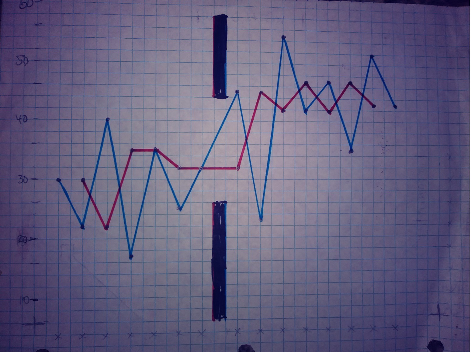
One way to smooth a time-series graph is by replacing data points with the median of three adjacent points (Marsh, 1988; Tukey, 1977). Suppose that the following observations were made for a 15-month period: 30, 22, 40, 17, 35, 25, 32, (intervention), 45, 23, 55, 42, 47, 35, 52, and 43.
First, plot these values the way the time-series results were plotted in Figure 10.2. Then plot the medians. The median of 30, 22, and 40, the first three points, is 30; this value is plotted for the second month. Then the median of 22, 40, and 17 (i.e., 22) is plotted for the third month. Continue through the entire series. By the way, you probably won’t get the point if you don’t actually do this!
When you are finished, you will see that the graph has been smoothed and the effect of the intervention can be clearly seen. This technique is useful when the intervention is expected to have a lasting change or when a change is permanent (as was the introduction of resident physicians in the hospital), but the measure of the outcome shows large random fluctuations from time interval to time interval.
A graph made by hand is shown on the next page.
The blue line connects the individual data points, whereas the red line is the smoothed line. The dark bars above and below the lines indicate where the intervention occurred. As you may see, the blue line hints that the intervention might have been helpful, but the red line is a much clearer indicator that the levels before and after the intervention were different.